Marialma
for Colunex
- Branding
2020

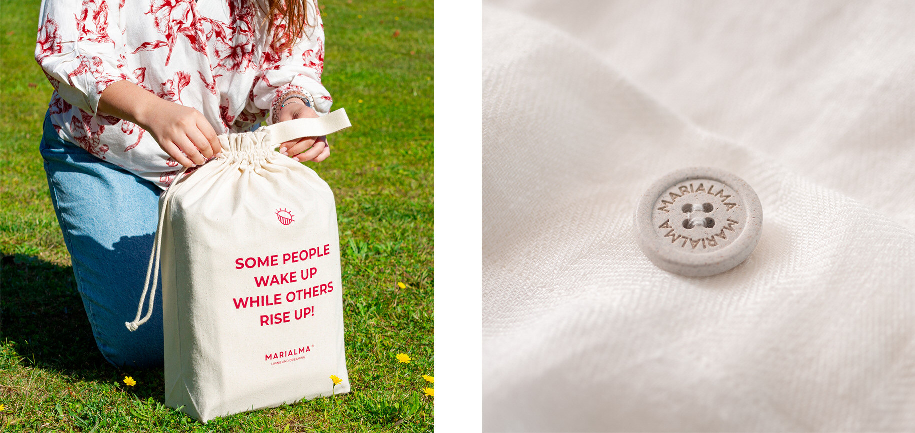
Some people wake up while others rise up
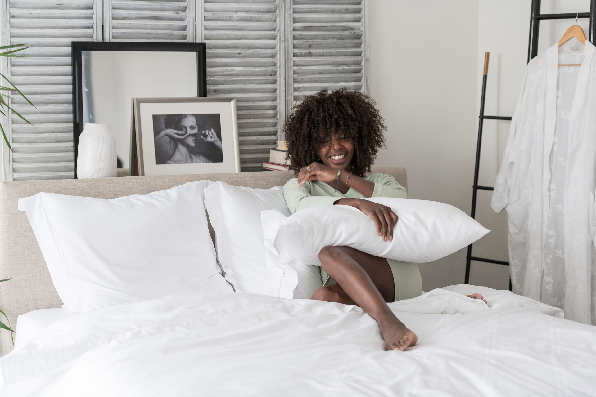
When it comes to buying bedding, people are overwhelmed by choice. That’s why Marialma's founders Ana Osório and Catarina Canto Moniz set out to build the name for performance bedding, sourcing exceptionally high-quality bed sheets with incorporated technology that promised to put an end to sleepless nights.
By taking performance bedding to the next level, and grounding them in the required balance of everyday life, we crafted a brand that reflects the impact of sleep on health and wellbeing.
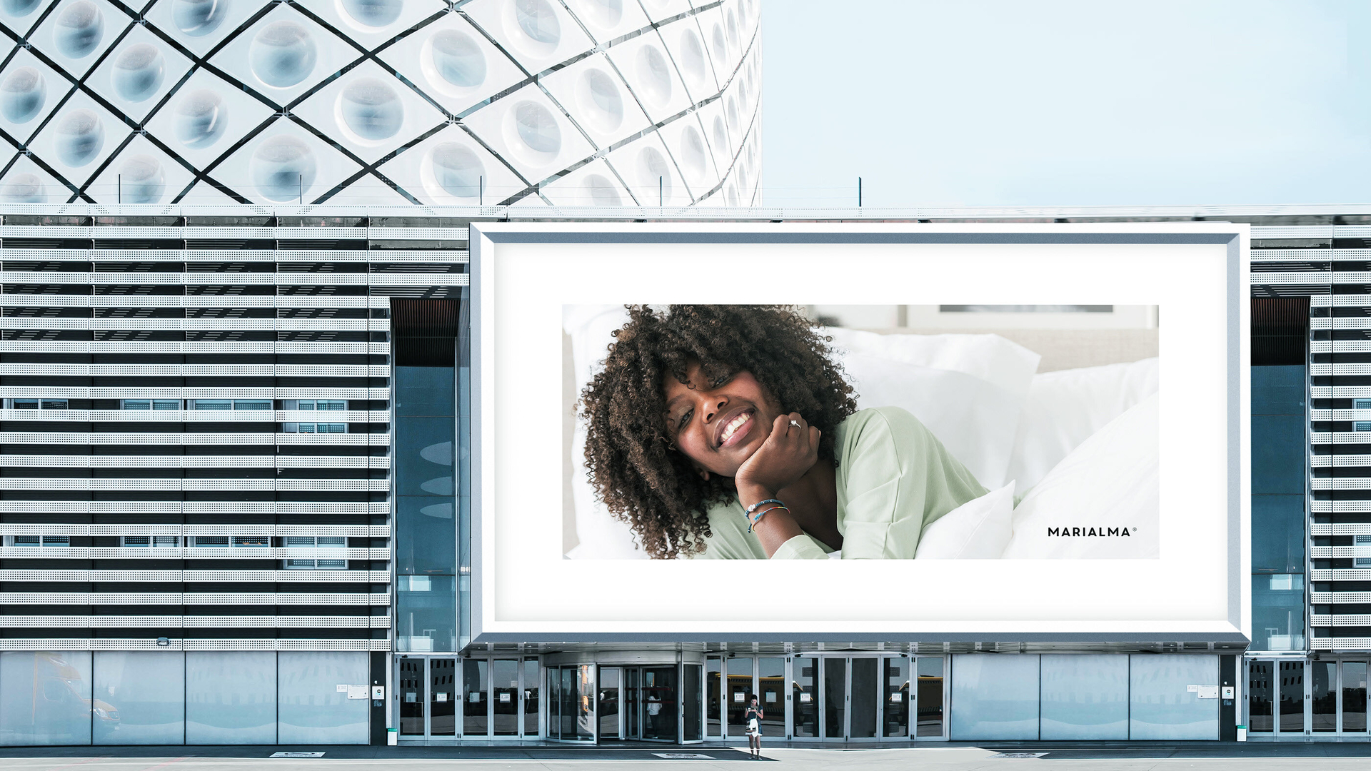
The go-to bedding brand for conscious women.
Marialma’s target was clear from the very beginning: Women that prioritize their health, that take time for their own happiness, and reflect on what they ultimately want. These women are conscious consumers that are concerned with the origin of the purchases beyond the label. They are all about working less, buying less, but live better!

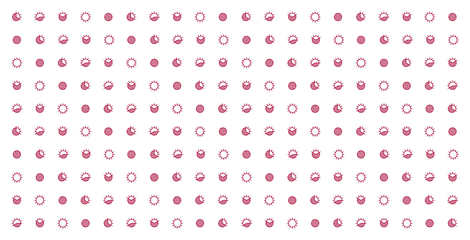
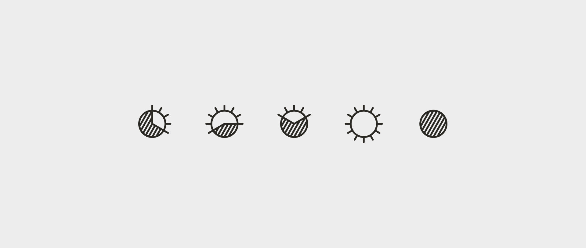
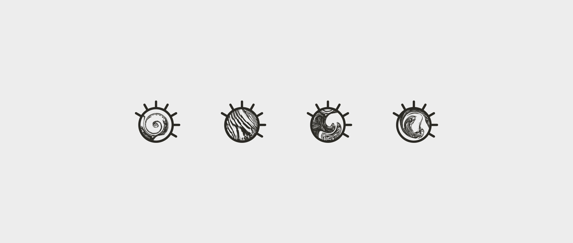
Simple at first sight but complex in detail.
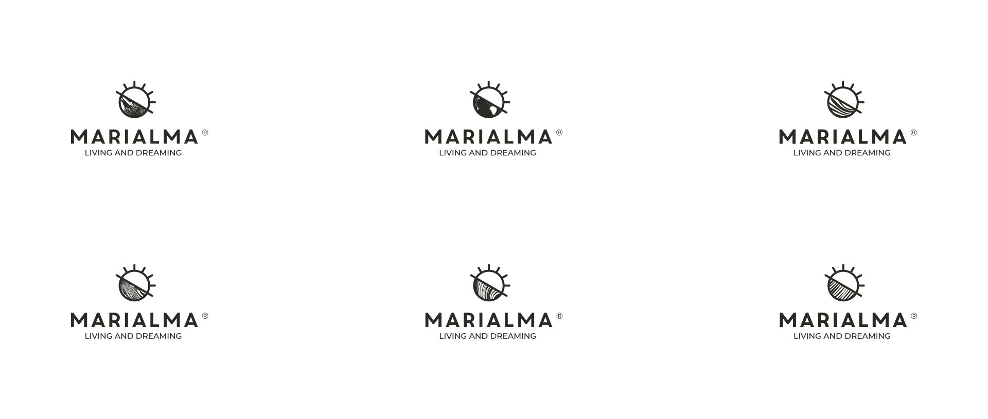
Producing the visual identity for Marialma presented a unique challenge, as it looks sophisticated and minimal on the surface, but it wields a versatile and lively personality underneath.We wanted to create something meaningful that would evolve and grow. Just like life itself. That’s why this logo conceptually illustrates the idea of time and balance. Day and night. Yin and yang.

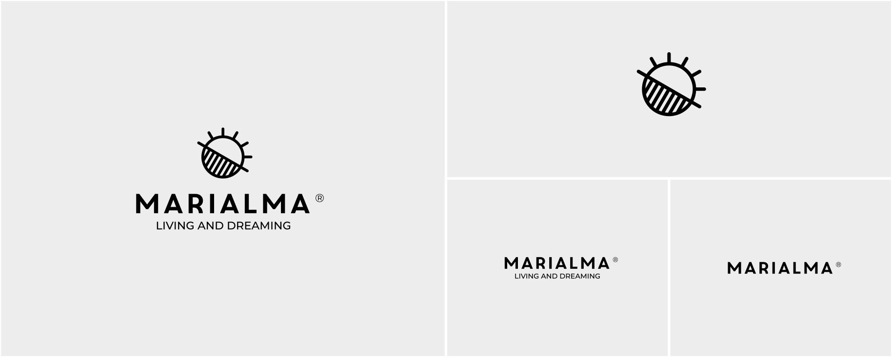

Reinforcing brand recognition.
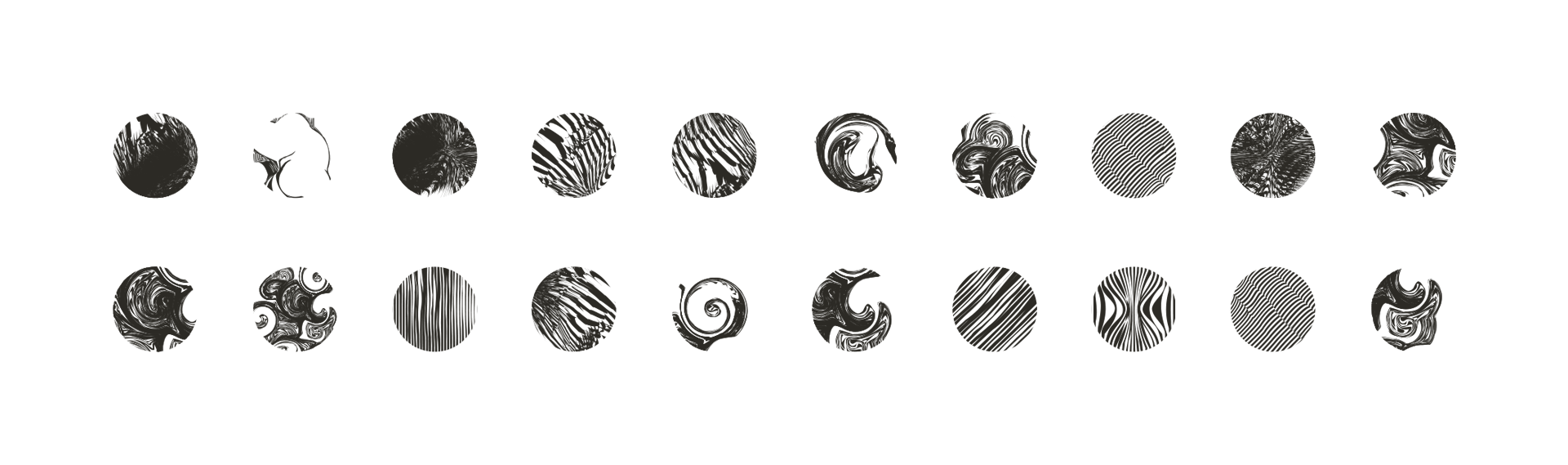
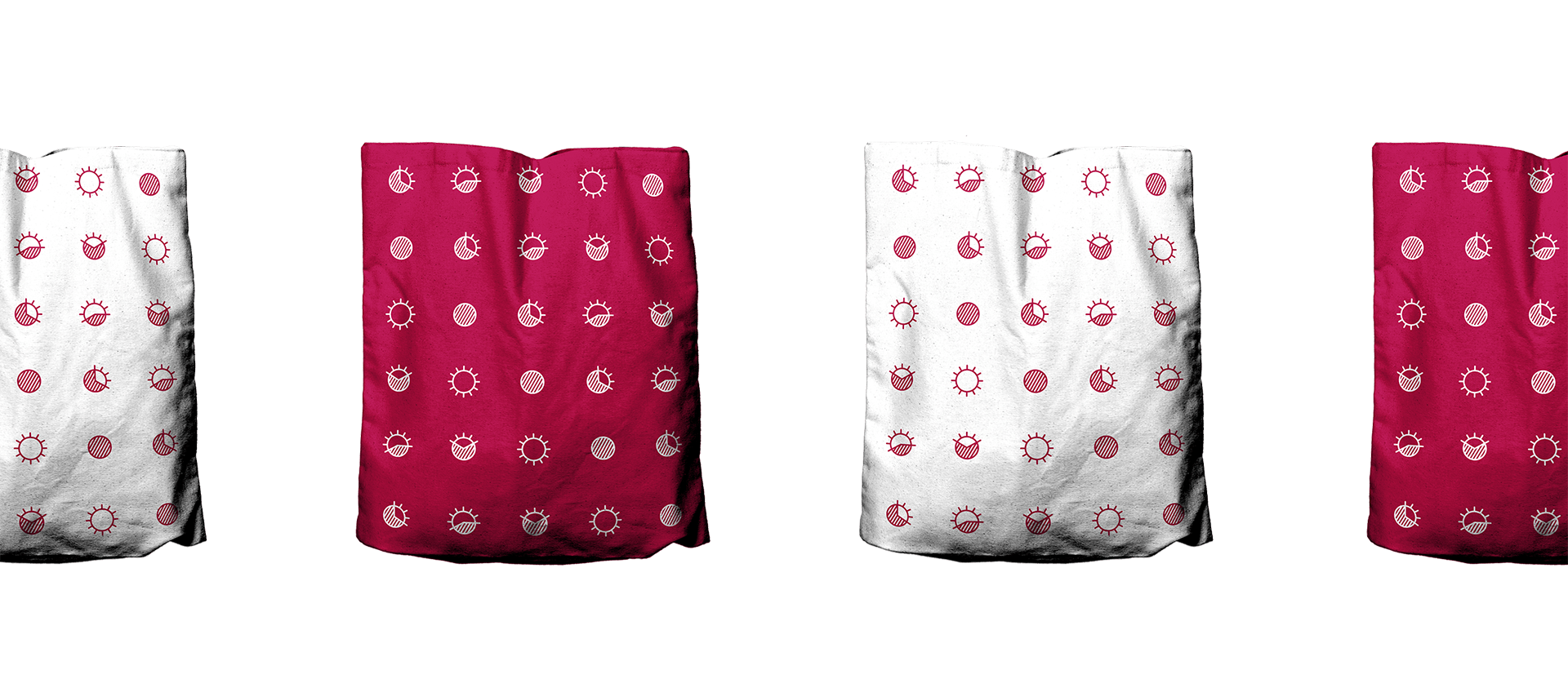
With a responsive logo design, we made sure that Marialma had plenty of visually-engaging ways to connect with their target audience, assuring brand recognition across multiple channels, resolutions, and applications. Inspired by the sheets’ threads, organic textures infused Marialma’s logo with movement, bringing softness, balance, and beauty to the result.
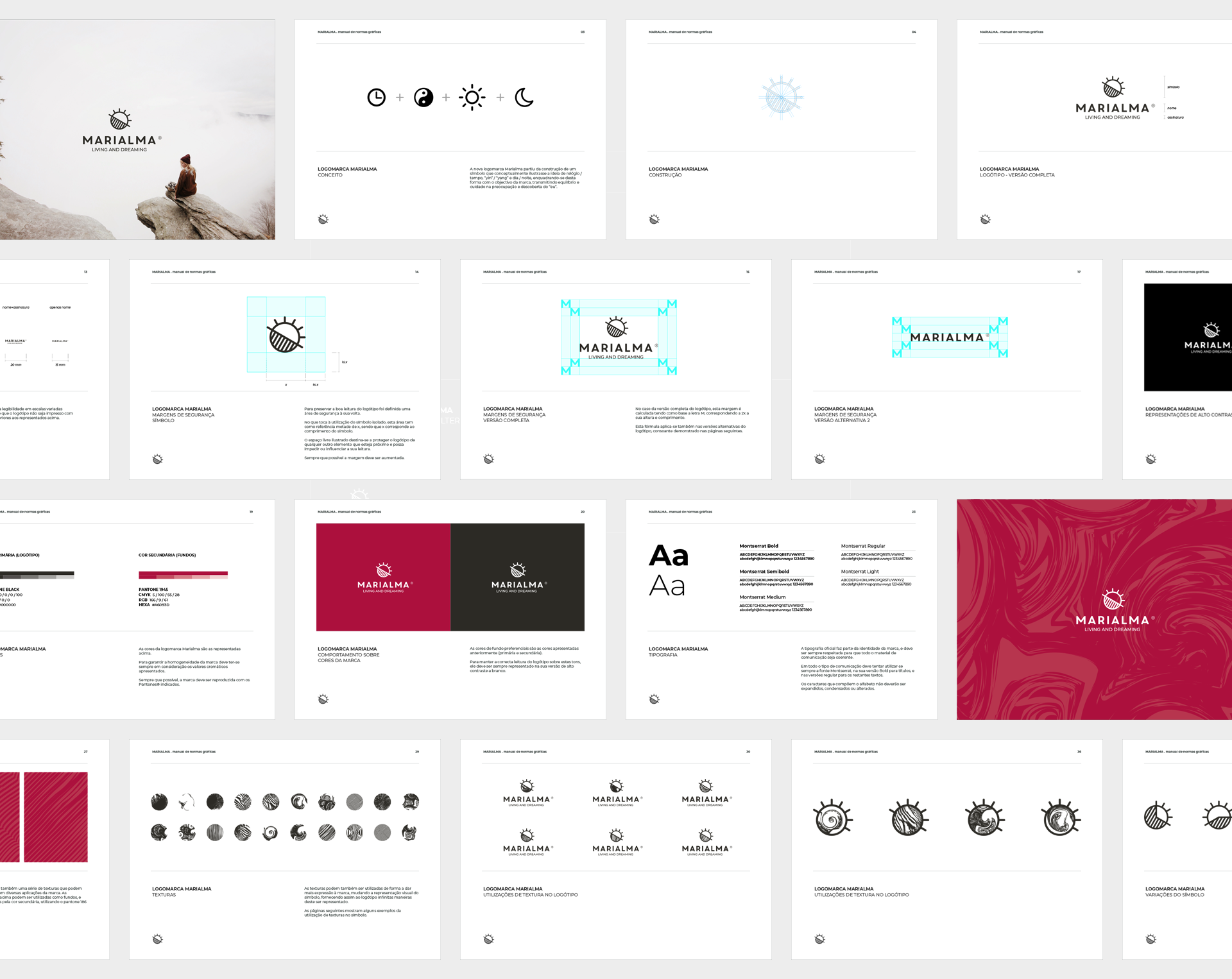
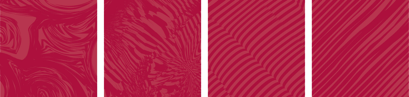
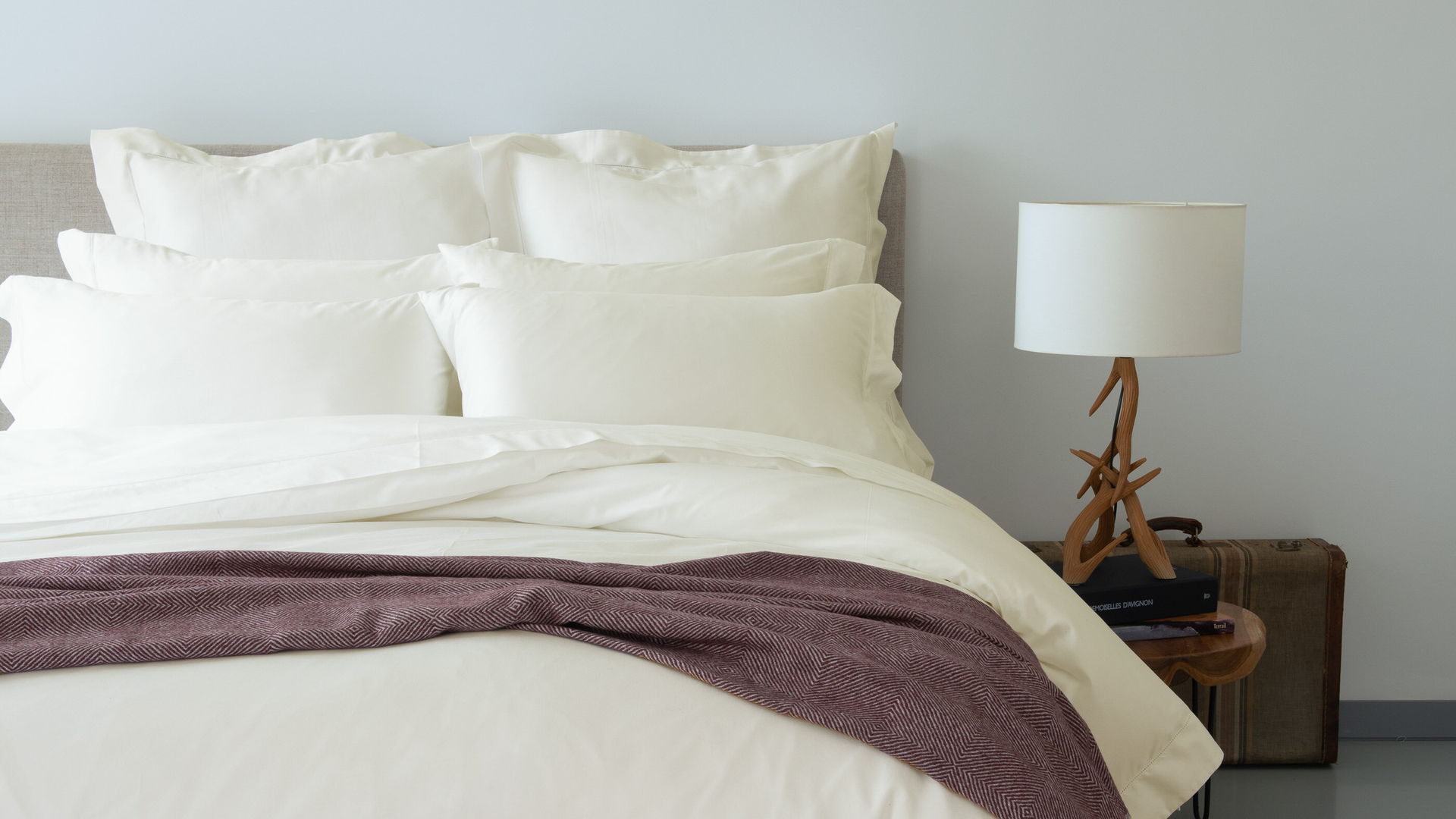
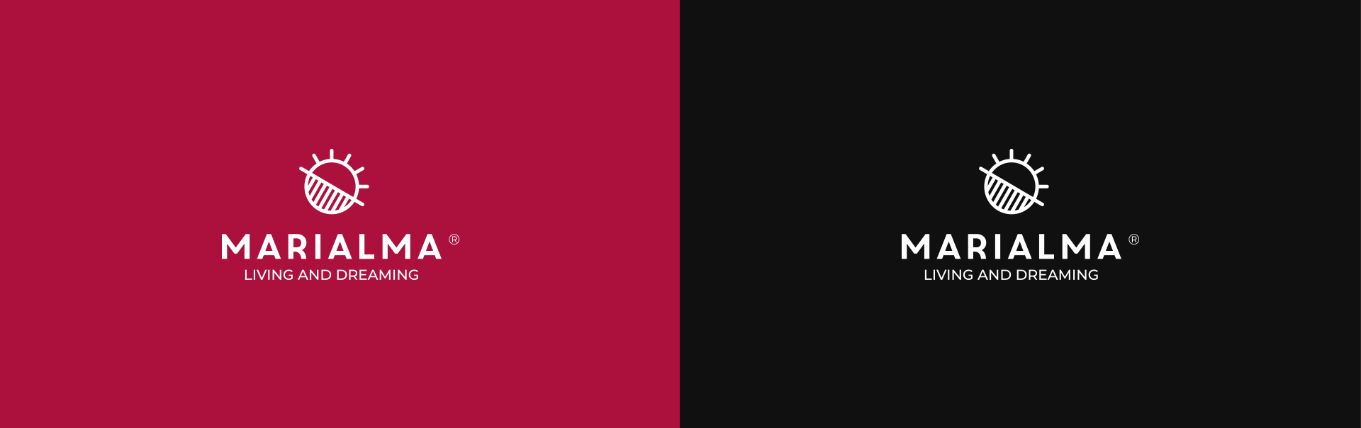
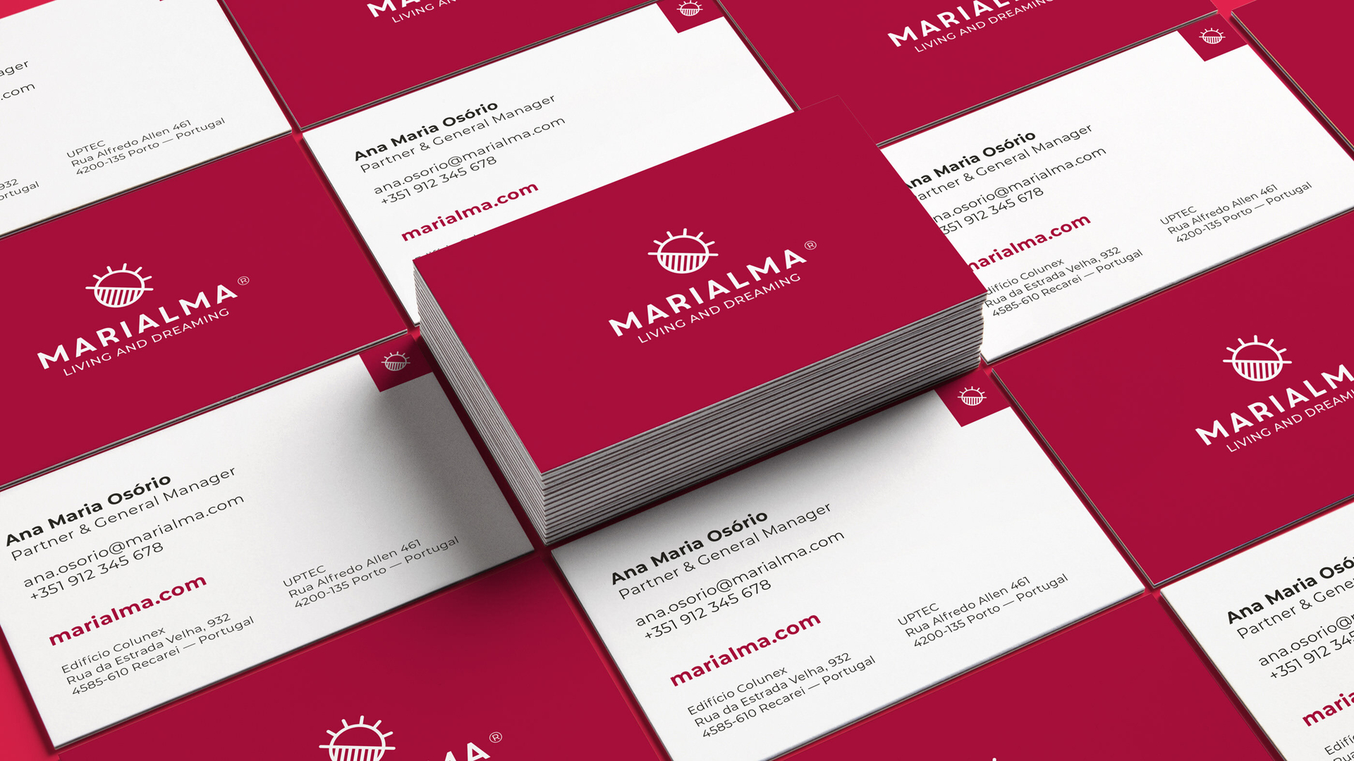
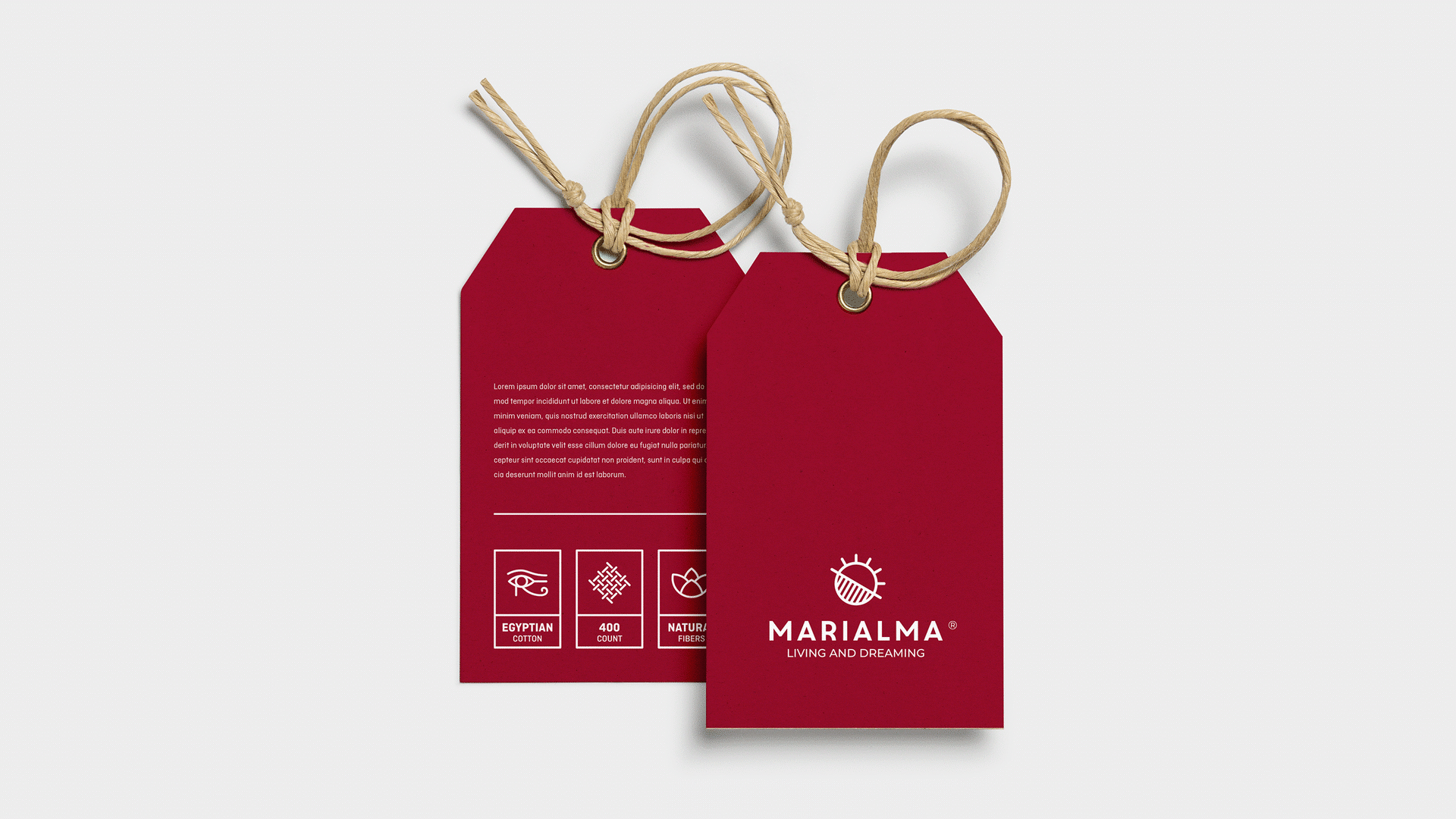
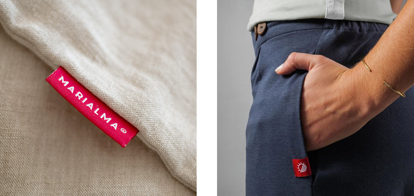
A disruptive color as a vital element of branding.
Some brands are so iconic that it is possible to identify them from just a single color without an accompanying logo. For that reason, our marketing team came up with the idea of using a vivid pomegranate red as it strongly separates Marialma from their bedding competitors and can’t be missed even on the smallest details. It is continuously used throughout the packaging, clothes labels, business cards, and tags, demonstrating an exceptionally consistent, strong brand image. Besides that, this distinct color scheme fully conveys some core brand values such as regeneration, beauty, and eternal life.
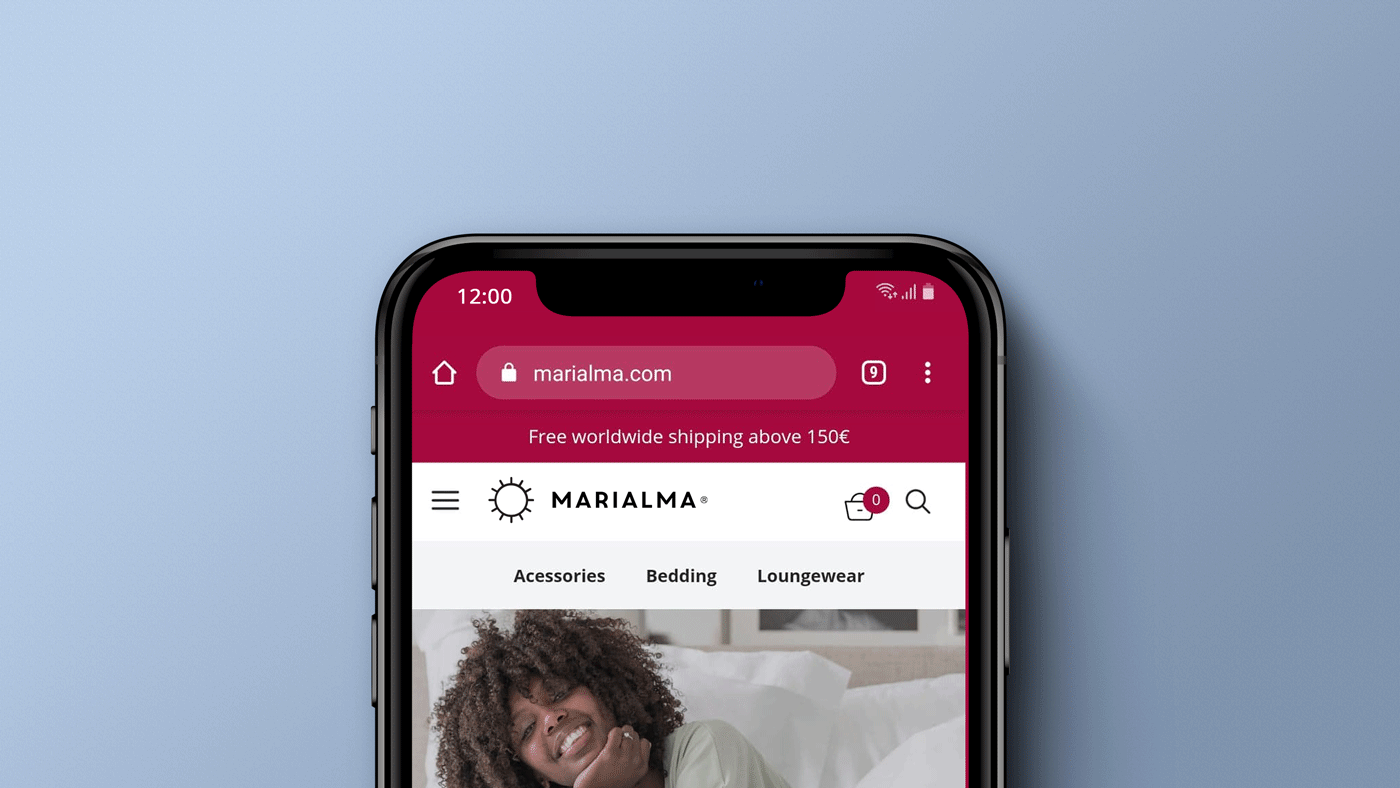
Shop the sleep of your dreams without leaving the bed.
Mirroring the refined, premium style of Marialma’s products, the online shop remains extremely minimalist. The hypnotizing logo animation that is always displaying the time of day, working as a digital clock, is just the icing on the cake.